Material Icons and Material Design Icons
There are some steps designers should take at the beginning of the design project. One of them is to set icon library to provide consistency across the design. It could be designed custom or chosen among libraries. Google’s “Material Design System” and its resources undoubtedly are one of the best and most-used ones.
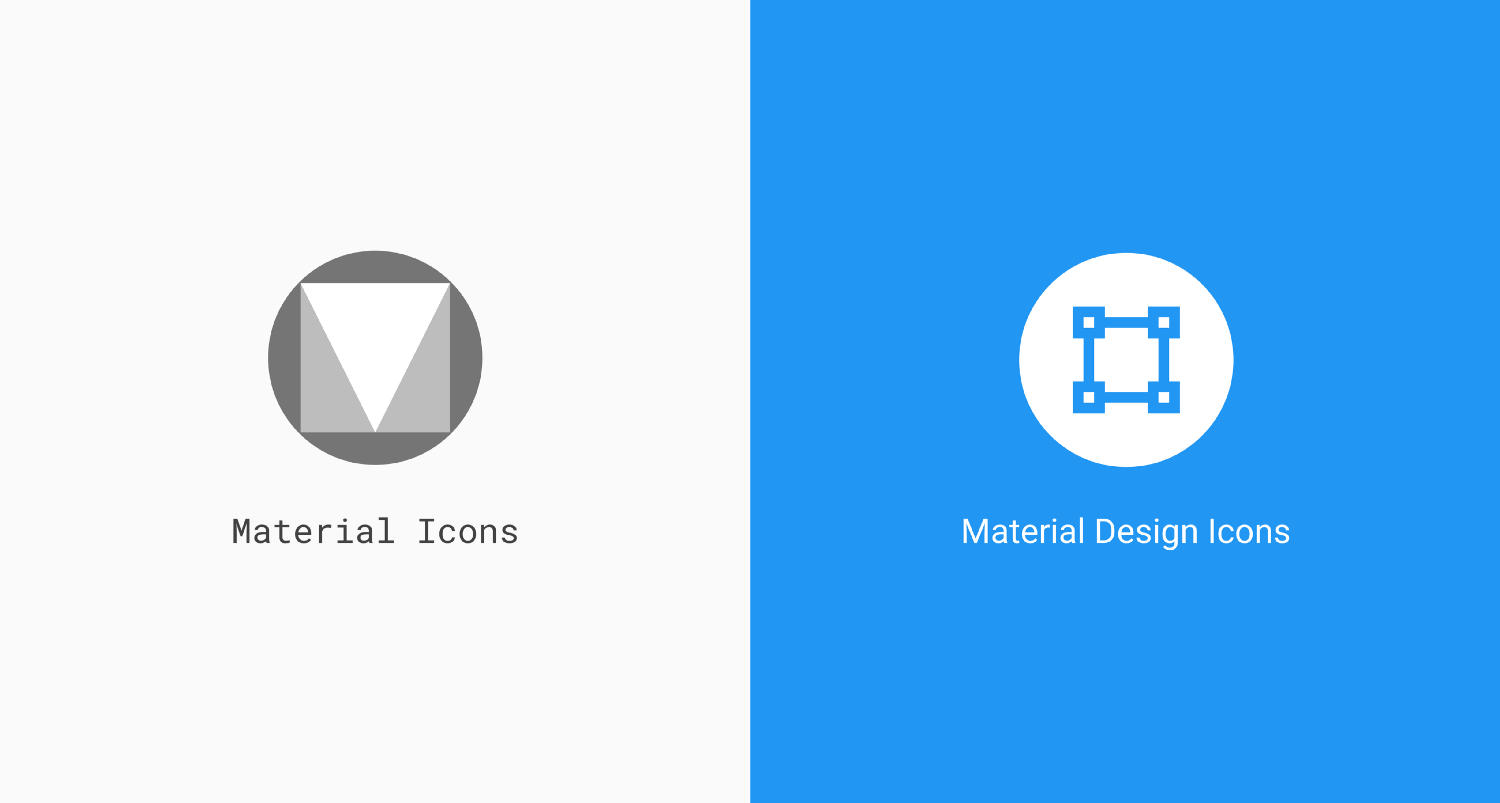
While searching about Material Design icons we discover two different terms Material Icons and Material Design Icons. Some sources approach and identify these terms the same way. They are both called Material, so it’s confusing. They are different, but there are some relations between two.
Material Icons
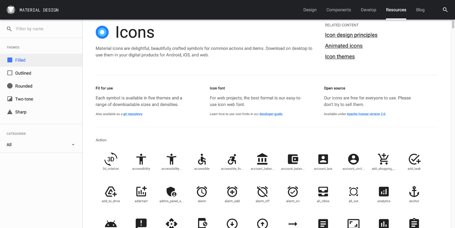
Material Icons is the official repository for Material Design icons and it’s owned by Google. There are more or less 1500 icons divided into several categories such as Action, Alert, Av, Communication, Content, etc. All icons are available in 4 themes — Filled, Outlined, Rounded, Two-tone, Sharp.
Material Design Icons
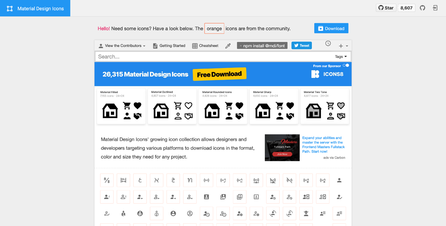
Material Design Icons aims to cover the gaps Google left with their set and allow a lot more community integration. Many icons are made by the site’s owners and some are submitted by users. They are supposed to comply with Material Design icon’s guidelines, but they’re not related to Google in any way. There are nearly 6000 icons in filled and outlined styles.
Differences and Relations
- Firstly, icons differ from each other by their names.
- Sometimes size and small details make the difference.
- Most icons are the same or created by the same guidelines.
Conclusion
Consider these points before using Material Design icons. To choose wrong sets for design and development processes can cause problems. The following links will help you to find resources easily.
Müəllif: Aydın Abbasov
ATL Tech - UI/UX Designer

